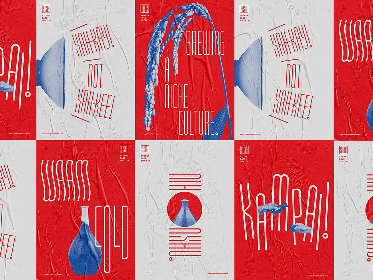
As an organisation that aims to bridge the gap between the niche saké culture and Sydney’s vibrant food and entertainment scene, Sydney Saké Society needs a modern, non-cliché and Western-friendly Japanese image. With this approach in mind, the omission of Japanese characters and traditional Japanese aesthetics (e.g. brush strokes and washi paper) forms the basis of the design direction.
The logomark is a seal stamp (commonly seen on saké bottle labels) comprises of 3 ‚S’s. A custom display typeface, developed based on the letter ‚S‘, echoes the modular Kanji stroke styles in seal stamps. The typeface is translated across the organisation’s collateral branding in a playful and flexible manner, using red and porcelain blue with complementary pastel colours.


Check out the Instagram and Behance sites.