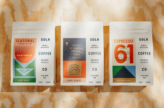
Sola Coffee Co was designed by Minneapolis based Studio MPLS. Branding, packaging, and lots and lots of type for an…
Posts tagged packaging
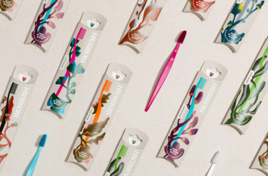
Biobrush by EIGA Design
An eco-modern brand design for the biodegradable toothbrush. It looks and feels like regular plastic. But what’s special about the…
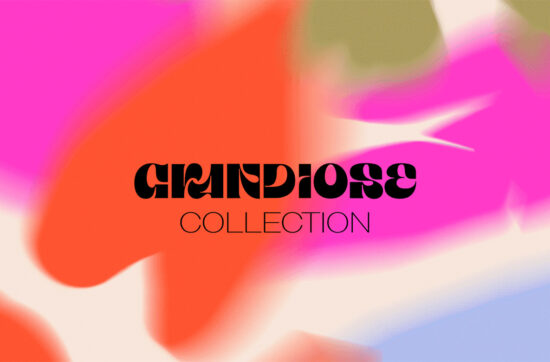
Grandiose Collection – Glassware
by DOMINGO
Grandiose Collection aims to bring elegance and refinement to everyday life, while also celebrating the artistic potential of glass. With…
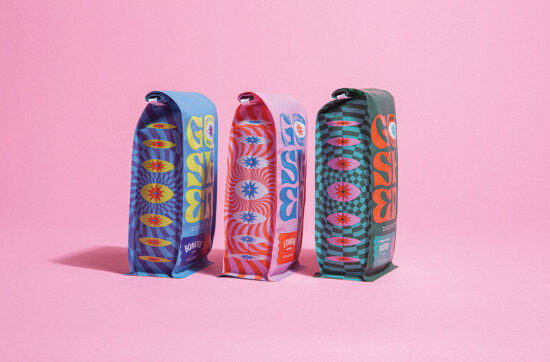
Goshen Coffee by TOKY
Twenty years of masterfully roasted coffee had earned Goshen a loyal following and plenty of potential to expand. What they…
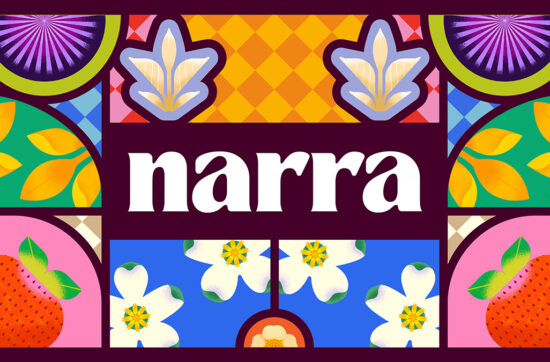
Narra by The Working Assembly
The Working Assembly partnered with the Reyes siblings to create the look and feel for the brand, knowing that the…
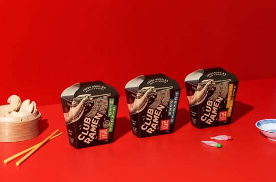
Club Ramen by Curious Design
The instant noodle world has a bad rep. Mainly because most of the products out there are notorious for being…
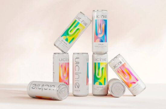
Uchie by Forner
Uchie is a healthier-for-you soda made with organic ingredients that doesn’t compromise on taste. Forner Studio helped them create a…
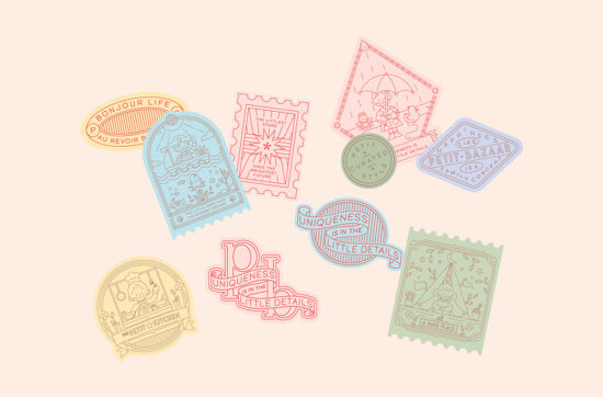
Petit Bazaar by Heavy
Petit Bazaar is a children’s boutique with endless options. Based out of Hong Kong, they curate products and collections worldwide…

Nutic by Fabula
The work from Fabula on the brand Nutic began unconventionally — with a bright design system and packaging design for…

Sammontana „I Classici“
by Auge Design
Complete restyling of the most iconic ice creams that belong to the summer memory of every Italian. Not old, just…

Gin Brasil by Sweety & Co
Gin Brasil is an e-commerce company formed by lovers of gin drinks and their botanicals. For the mission of making…

Kiki – Cocktails by Oat
The founders of Kiki approached Oat to rebrand the identity and packaging for their premium cocktail brand. »Kiki« is defined…

peligro
by Mayuko Kanazawa
Unconventional, „peligro“ keeps changing in taste and appearance. It is a new concept of ginger syrup that changes with the…

Havsnø by Goods
With one of the longest coast line in the world, Norway is known for its bountiful sea. Yet the Norwegian…

Optima Planta
by Pond Design
Optima Planta grow herbs with humidity in AI controlled boxes. It’s called aeroponics and it enables super local and sustainable…