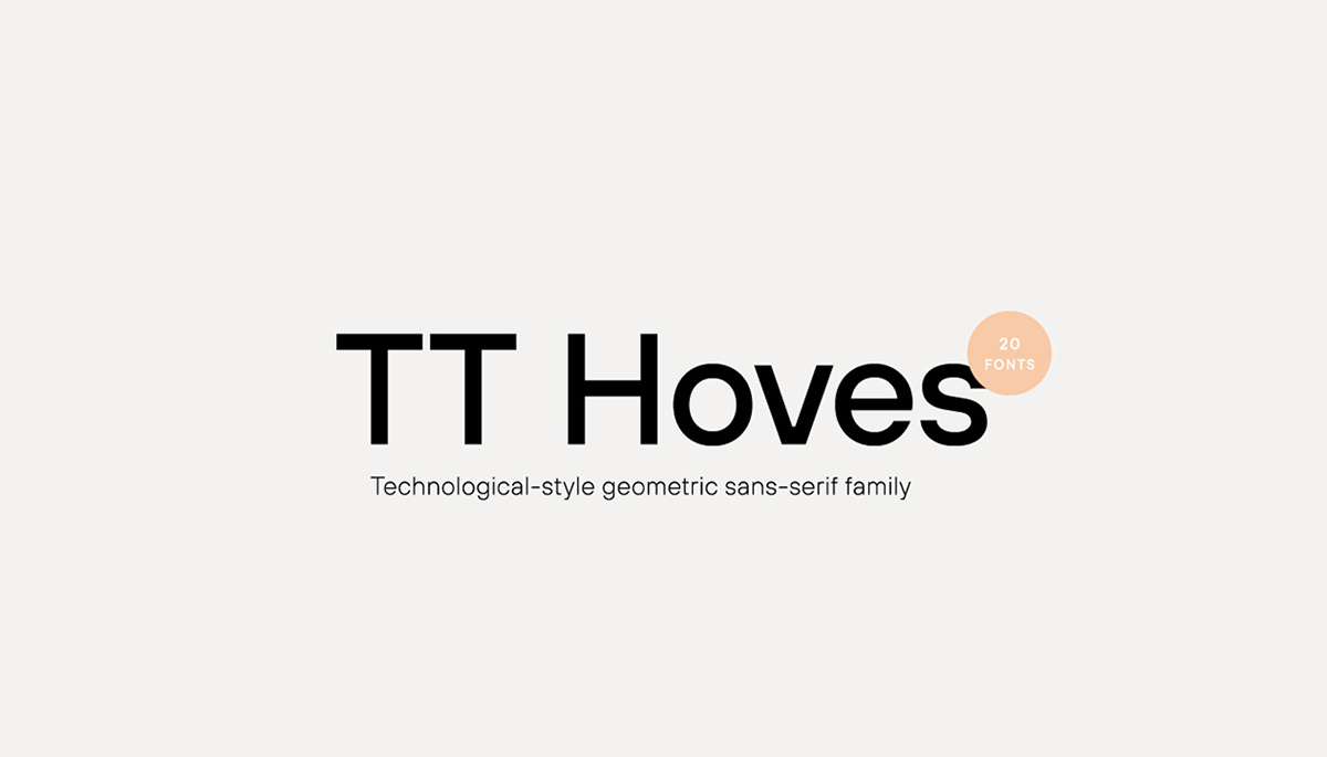
TT Hoves completes the TypeType font trilogy dedicated to modern sans serif. The first was TT Norms – the universal geometric sans for the widest possible range of tasks. The second was the neutral sans TT Commons, which was originally designed as a corporate typeface for TypeType studios.
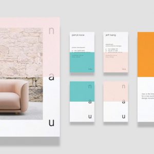
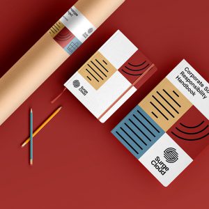
Unlike the first two typefaces included in the trilogy, TT Hoves has a distinct character, but without too bright bursts or kinks – it’s not too neutral and is moderately bright. We wanted to create a sans serif with recognizable patterns and geometry that would be perfectly suited for solving visual problems in such areas as architecture, design, industry, science, astronomy, drawing, high tech, research, space, statistics.


