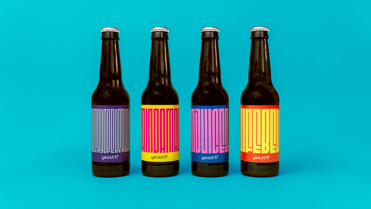
Yeast17 has been founded in 2017 by five mates mostly based in South London who really just love drinking beers rather than making them. The name is a ‘pun’ of a famous 90s boy band called East17, most of the beer names are puns based on a strong irony. All the brewing process is based on causality, random choices and good laughs. This is the spirit of Yeast17: a fun group of friends that don’t take themselves too seriously and that produce beer without scientific knowledge. The task was to develop a new robust visual identity to help them achieve their goals of being stocked in local craft beer retailers.
The wordmark design embodies the playful spirit of Yeast17 brand with rotated letters and its idiosyncratic custom designed typeface. The visual research leads to the creation of a bold and vibrant colour palette reflecting the pop culture of their naming along side the usage of the uncompromising and unmistakable typeface Fit. The typeface adapts its forms to the space within the label limits, in this way the beer’s names become a graphic property in itself creating different patterns for each beer. The result is a new visual expression that is distinctive on the store shelves and that embodies the soul of Yeast17: ironic, pop, anti-boring, bold and playful.


Check out the Instagram site.